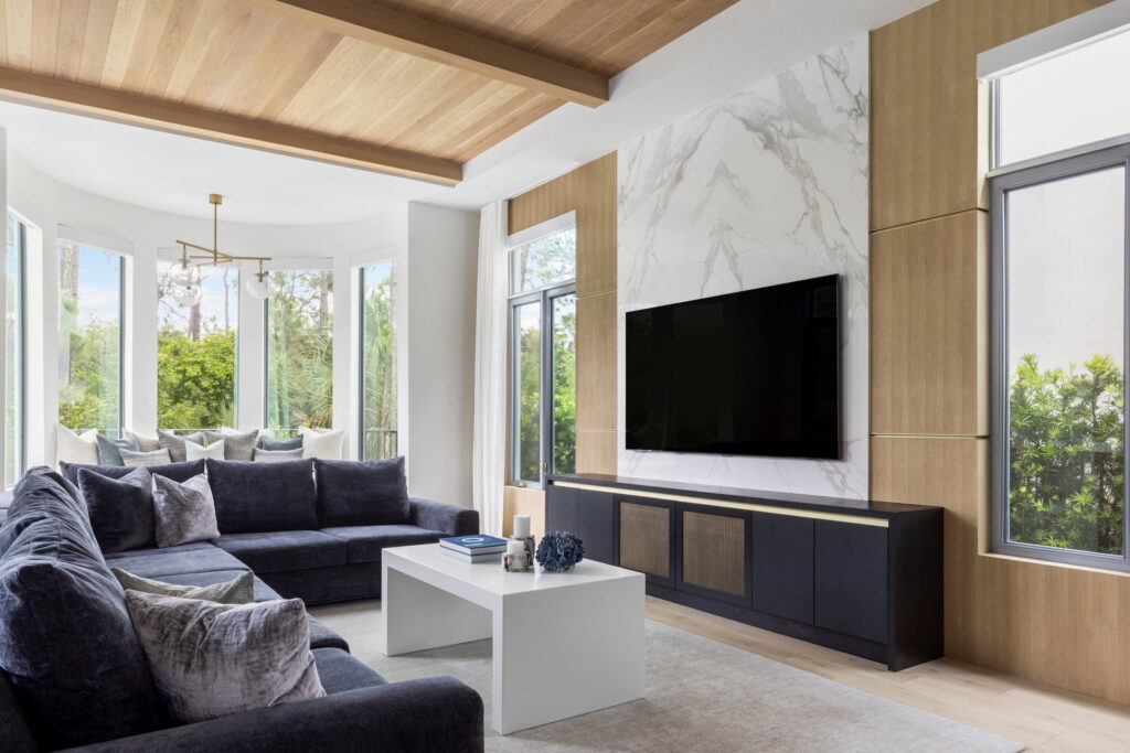
The tray ceiling runs more than forty feet across the kitchen and great room. That is a lot of surface to get wrong. When Kelli Riggs and Perla Delacruz, co-founders of Interiors by Casa Mia, first walked this Palm Beach Gardens home, that ceiling was bare and white, the same as everything else. The potential in it was immediate.
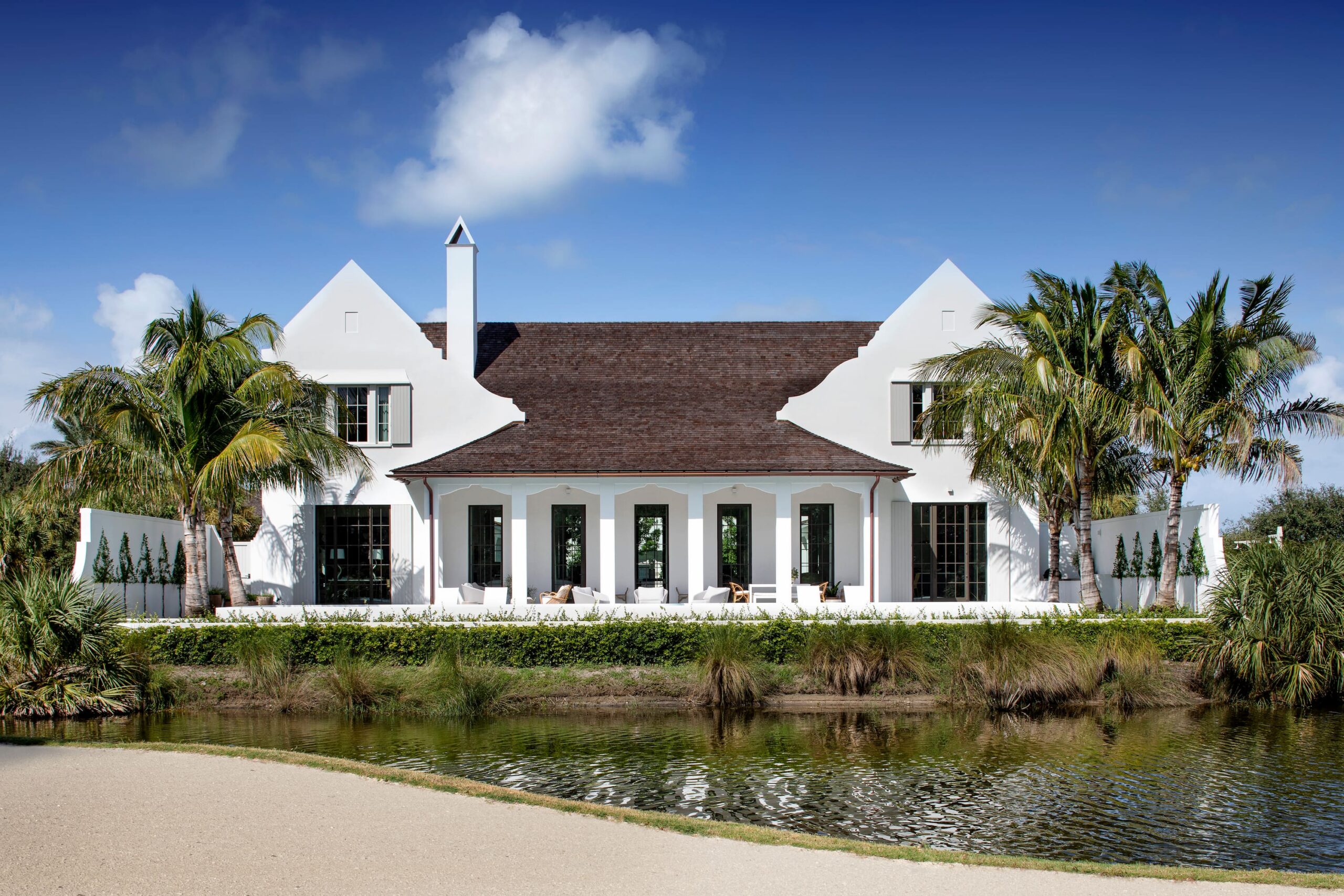
In its bones the home was beautiful, and in its finish it was punishing. High ceilings, expansive tray work, a soaring foyer above the stair, white throughout, and finished in a way that read as high-gloss and cold rather than as the architectural asset it was. The brief was simple and the difficulty was real. Keep it modern, make it warm. Getting both things at once, without one canceling the other, is the problem that animated every decision in the house.

What the Ceiling Knows
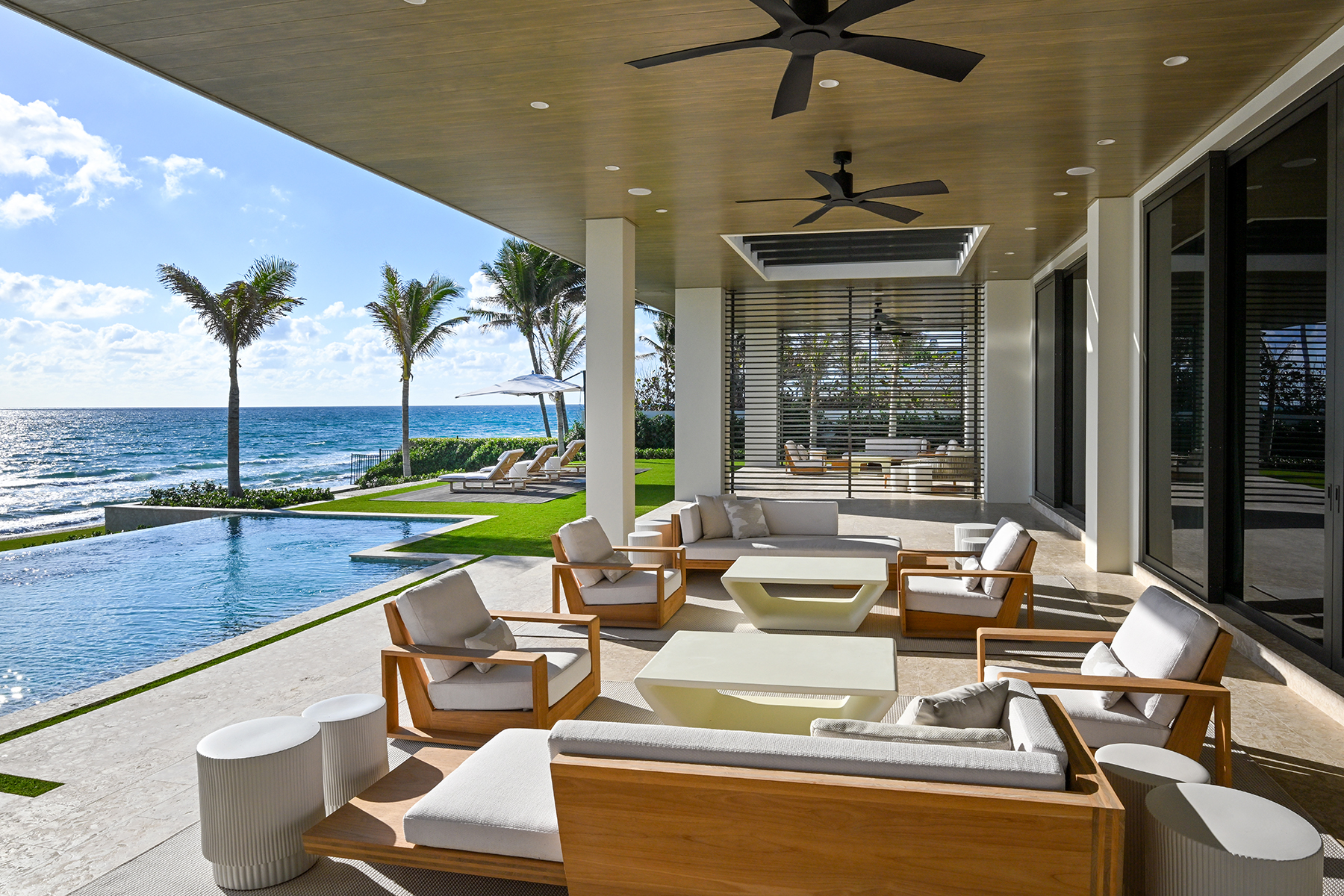
Their answer was in the materials, and in refusing to treat modern and natural as opposites. Black oak furniture and leather seating gave the rooms weight. Alabaster lighting, plaster walls, linen drapes, and wool rugs gave them warmth. Each was natural where the original palette had read as cold, and specific enough to hold the modern character of the house intact.
The ceiling was where the most exacting work happened. White oak millwork now runs the length of it, but the warmth had to arrive without the wood asserting itself. “We hand selected every single board to ensure that we didn’t introduce too much of the wood’s natural knotting or shade variation so that the modern palette was maintained,” Riggs says. It is the kind of decision that rarely registers consciously on a visitor moving through the space, but registers absolutely in how the room feels.
Resolution at the foyer took a different form. Its twenty-four-foot ceiling volume above the staircase, left unaddressed, would have read as institutional. Instead the space grounds itself through custom millwork on the stair wall, a console table, and the vertical rhythm of the railing, with impact lighting scaled to the height and the whole composition held in check by light filtering through from the adjacent rooms. The mirror above the console catches the dining room opposite, pulling the two spaces into quiet conversation.

Where the Client Ends and the Designer Begins
Part of why the home holds together is that the client and the designers wanted the same things. The masculine edge running through the furniture and metalwork, the coastal photography and artwork reading across several rooms, the consistent preference for natural materials over synthetic ones. These were the client’s instincts as much as the designers’. “The color palette, masculine features, coastal photography and artwork, and appreciation for natural elements were all a reflection of the client’s preferences,” Riggs says.
That kind of alignment is something Interiors by Casa Mia works deliberately to build. Clients are invited into the process as collaborators, joining sourcing trips, weighing in on decisions, or handing the firm an early conversation to translate into a finished home. The aim is a space that reads as a representation of the people who live in it, not only a beautiful one. When the client wavered on a single material selection partway through, unconvinced it would cohere, the directors offered reassurance and let the finished room make the argument. Once it was complete, the client loved it.
The two of them have worked together long enough to have built an internal quality check of their own. When their instincts diverge, they don’t resolve it by compromise. They go back to the drawing board. “We’ve learned over the years of working together that our best work comes from unanimous decisions,” Kelli says. “If there’s a disagreement, that doesn’t mean that one person is right over the other, it means that there’s room for improvement on that given idea.” On a project carrying as many decisions as a full home renovation, that standard shows. Nothing in the house reads like a compromise.
The Room That Earns the Read
Not every room in the house works in the same key. The darkest of them, low-lit and walled in charcoal, was designed for movies and games and makes no apology for it. Where the main living areas hold to warm neutrals and natural oak, this one presses into brass and shadow, with a slatted ceiling, a popcorn machine, and a wall of framed posters that signal exactly whose room it is. The powder bath does something similar in a smaller register, with deep-toned plaster walls, a light stone vanity top, and a single narrow mirror, a deliberate pause in a house that otherwise runs light.
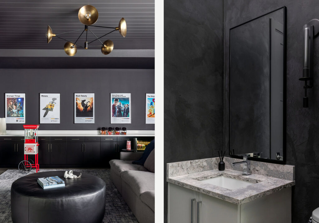
These darker rooms are what give the lighter ones their meaning. A house that only knew one register would have arrived at warmth by default. This one moves the other way wherever the program asks for it, which is the surest sign that the ease running through the rest of it was chosen rather than stumbled into.
None of it announces itself, and that was the intent from the first walk-through, when the ceiling was still bare and white and Riggs and Delacruz could already see what it could be. Look up in the great room now and the ceiling that started it all is the thing that holds the room together.